









Headquartered in Europe, Trouw Nutrition is a global leader in animal nutrition and plays a significant role in the global food supply chain by contributing to the efficient and sustainable production of animal-based protein.
We helped them refine and consolidate their brand including designing and writing a set of up to date guidelines to help ensure all collateral is consistent across various platforms, countries and operating companies.

Trouw Nutritions AgriVision Conference took place in Utrecht in the Netherlands in 2021 and was streamed to a global audience. An industry leading, feed-to-food event, AgriVision brings together key industry players and change-makers from across the world who share the same ambition: producing quality proteins to feed a fast-growing population, without straining the planet’s resources in the process.
We worked with animators and content creators from around the globe to create a flexible branding system for the event which spanned all the programme collateral - this work included everything from art direction and motion graphics to an integrated, multi-channel campaign and a host of other graphics and visualisations.

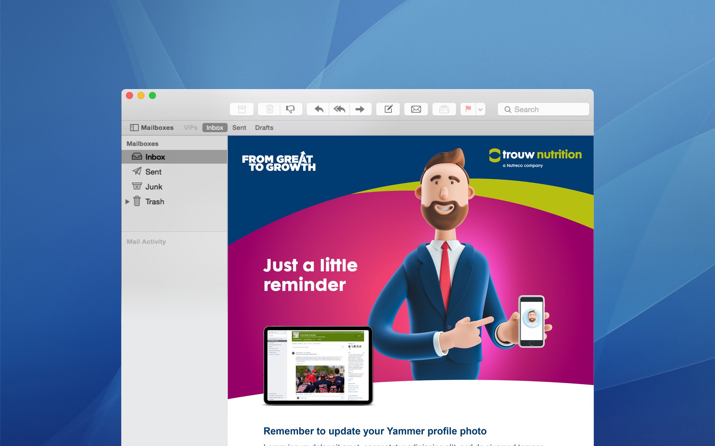
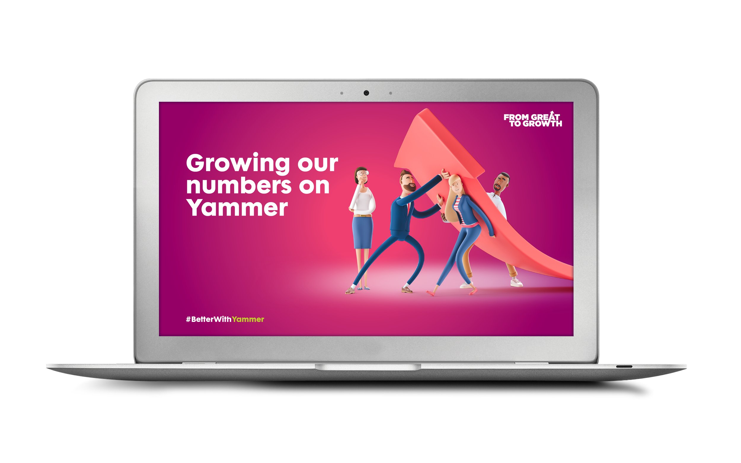
The From Great to Growth program was established as an internal Trouw Nutrition initiative aimed at helping their sales team around the world to grow.
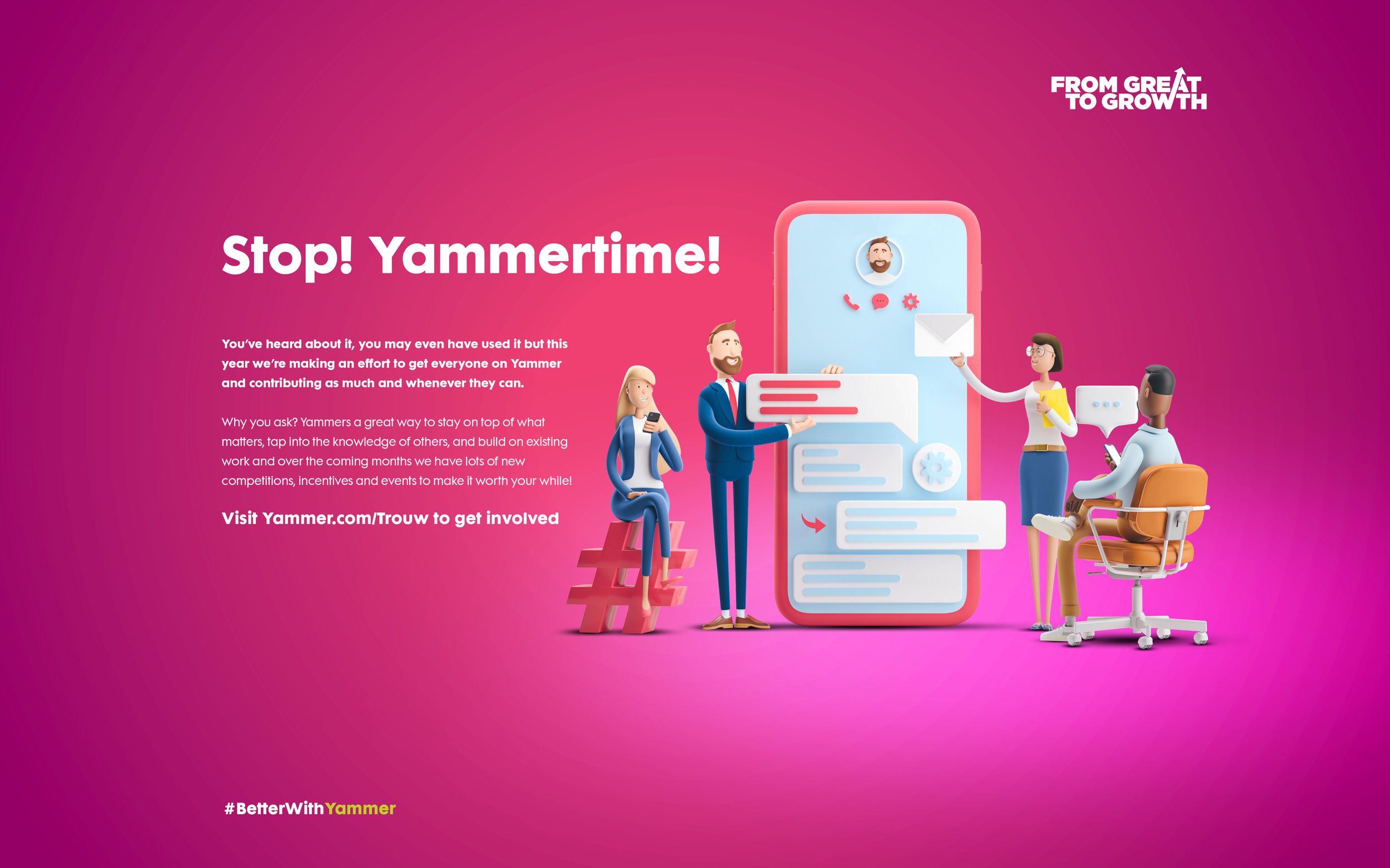
Since this is a global change program for all customer facing staff, Trouw Nutrition wanted to stimulate community feeling, best practice sharing, collaboration and peer-2-peer support in a fun way.
We divised a year long strategy that helped to improve interaction and build excitement through a series of incentivised competitions; YamJam coffee mornings, online polls and physical events making Yammer the platform of choice for all their commercial excellence, SPIN and From Great to Growth content.

After a successful brand audit for sister company Trouw Nutrition, Skretting; the global leader in nutritional solutions and services for aquaculture tasked us with creating a suite of 10 motion graphics pieces for use across a range of media for their new sustainability report.

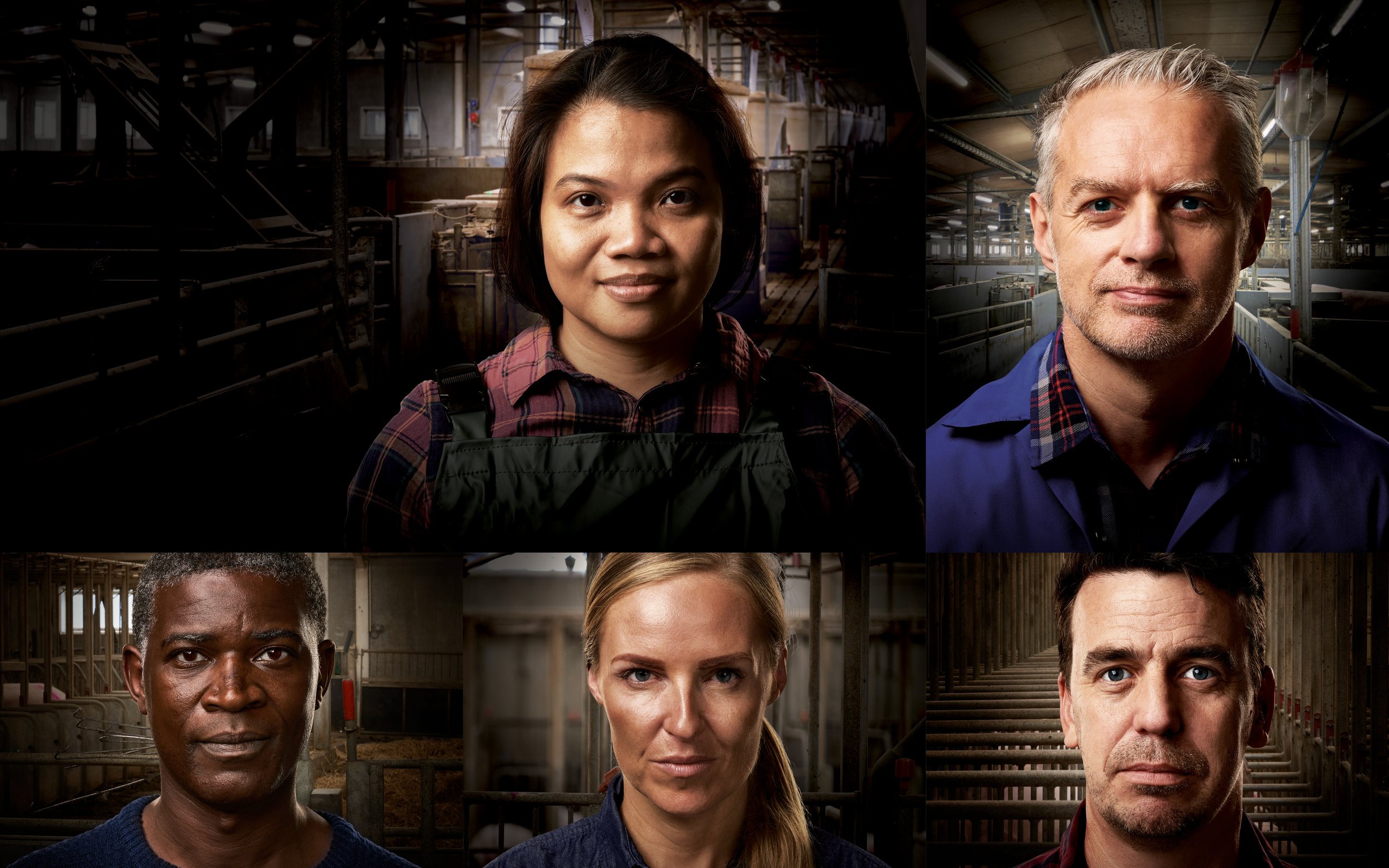
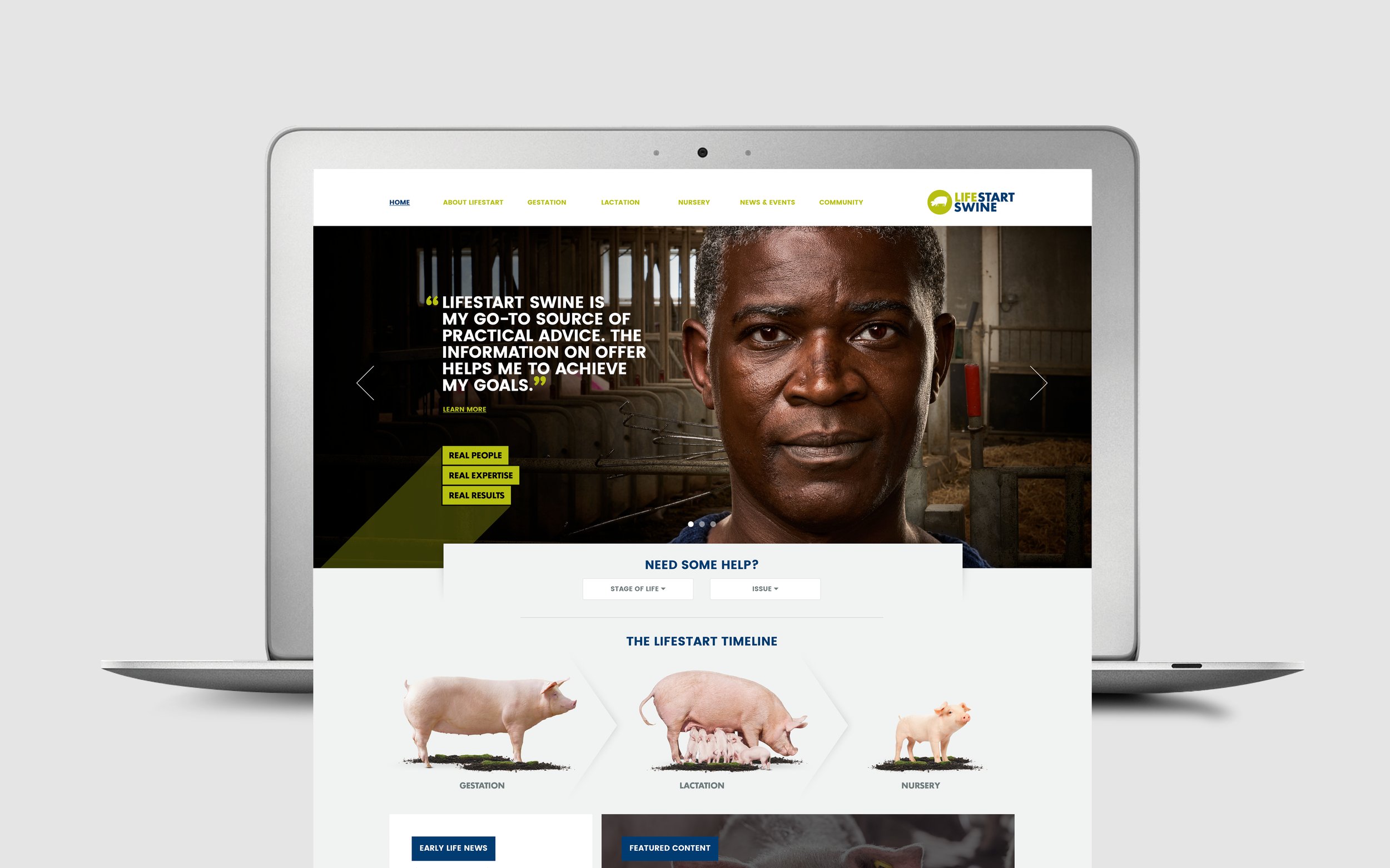
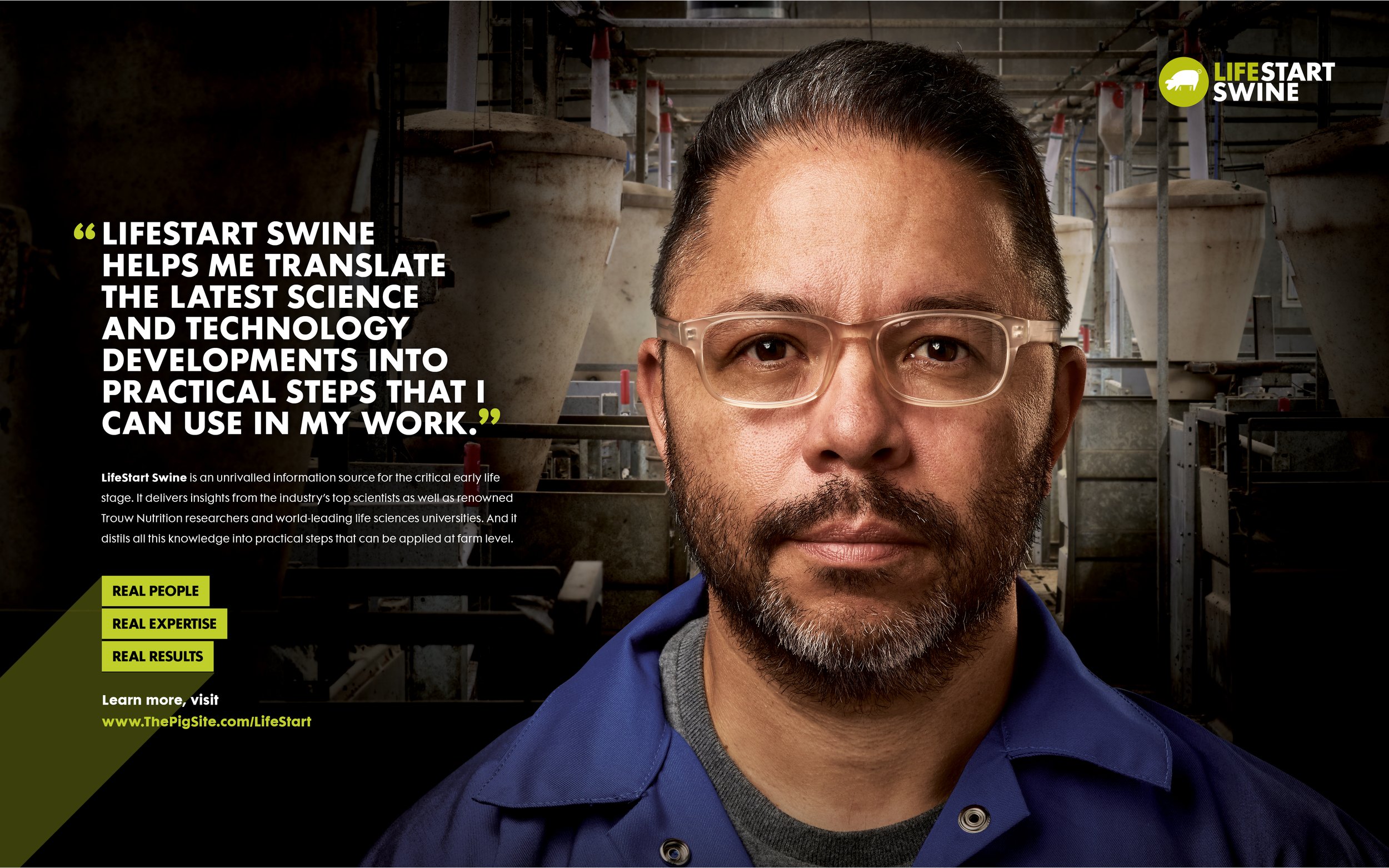
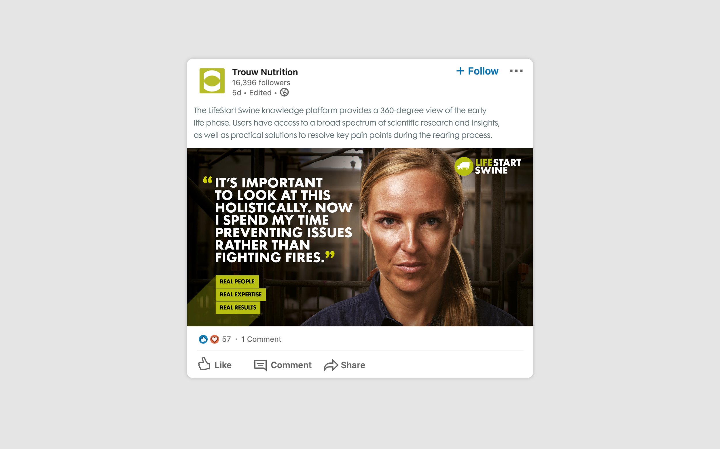
We worked with LifeStart Swine in creating a new a multi-channel campaign to drive traffic to their new website. The site utilises research, science and expert perspectives to identify best practices in the early life of piglets – interventions that have been shown to have a measurable influence on lifetime performance.
A truly global campaign, we used a series of different models and paired them with insights taken from producers and users to create a series of modular, targeted communications.

ARC Regulatory are a successful regulatory consultancy who trade globally with many of the worlds largest medical companies from their base in Northern Ireland. Earlier this year we were tasked with updating their branding and rolling this out to a range of printed and online collateral. This work ranged from brand and brand guidelines to a new website, stationery and host of other materials.

The new marque uses the negative space of the letter ‘A’ to make a plus sign. The plus sign can be perceived in a number of ways. It’s the international symbol for medicine or the mathematical symbol for addition. This is reinforced by the fact Arc itself can be seen as an additional resource or ‘add-on’ to a business’ regulatory wing.

The brand rollout encompassed a new content managed website, conference graphics, on and offline marketing as well as direct mail, brochureware and stationery.

Doublejump Studios is a boutique motion graphics and video production company based in Belfast. They produce dynamic visuals for online, business and broadcast. When they approached good to design their new brand we knew what we had to do. Their new marque is a simple graphic interpretation of the name; a double jump visualised.

Jam is a small Restaurant based in a busy Belfast retail environment. It caters for hungry shoppers in need of a quick, wholesome and tasty meal. The brief was to create a simple, flexible brand that could be used on all of their print and screen collateral. The result was a brand built on a fun typographic style that could be used to grab busy shoppers attention with strong messaging and was used everywhere from signage, menus, van livery and stationery.

Founded in 1986, American firm Kantech designs, markets and supports integrated access control technologies that are ready to use right out of the box. For the launch of their new KT-1 one door controller they wanted to focus on it's simplicity and ease of use. The existing branding was visually busy and the messaging badly defined. We decided to move away from this outmoded look and feel and differentiate the new brand by adopting a much cleaner, more focused approach. We stripped out the unnessessary, fussy and decorative elements from the collateral and focused on highlighting the brands core USP’s while also revising the brand marque; making it simpler, cleaner and more focused.

good designed the branding and labelling for Norn Iron Brew Co. and came up with a strong, confident and in your face marque. The marque takes typographic queues from the industrial past of Northern Ireland and Belfast (in particular the Docks) and combines this with a thouroughly modern, stylised image of barley and hops; the main ingredients of the product. The labels were drawn from well known geographical locations throughout Northern Ireland. The personality of these locations mirror the personalities of the beer. For example Norn Iron Brew Co.’s Rye takes its inspiration from the craggy top of the Mourne Mountains… A sharp taste to match the hard granite summits.

The creative for 2015’s NI Hospice Walk was based around a bespoke, hand drawn illustration that highlights the specific locations hosting this years event. It’s a modern, visually rich and eye catching graphic that works equally well on a flyer, a T-shirt or a 48 sheet poster.

The managing director of what is now the Griffin Group approached good to brand a new company that dealt in; and protected clients intellectual properties. The name comes from the legendary Griffin, a creature grounded in the lore of ancient Greece with the body of a lion and the head and wings of an eagle. As the lion was traditionally considered the king of the beasts and the eagle was the king of the birds, the griffin was thought to be an especially powerful and majestic creature. According to Greek legend, Griffins are known for guarding treasure and priceless possessions – the perfect emblem for the new brand.

Strung is a new app that helps small and medium size businesses track time, log expenses, invoice clients, manage contractors/employees and much more. good handled everything from the brand naming and art direction to the user interface design and marketing materials.
Visit www.strungapp.com to sign up.

Codetronic are a young, dynamic team of social media experts. Their brand takes its inspiration from the 80’s video games they grew up on.

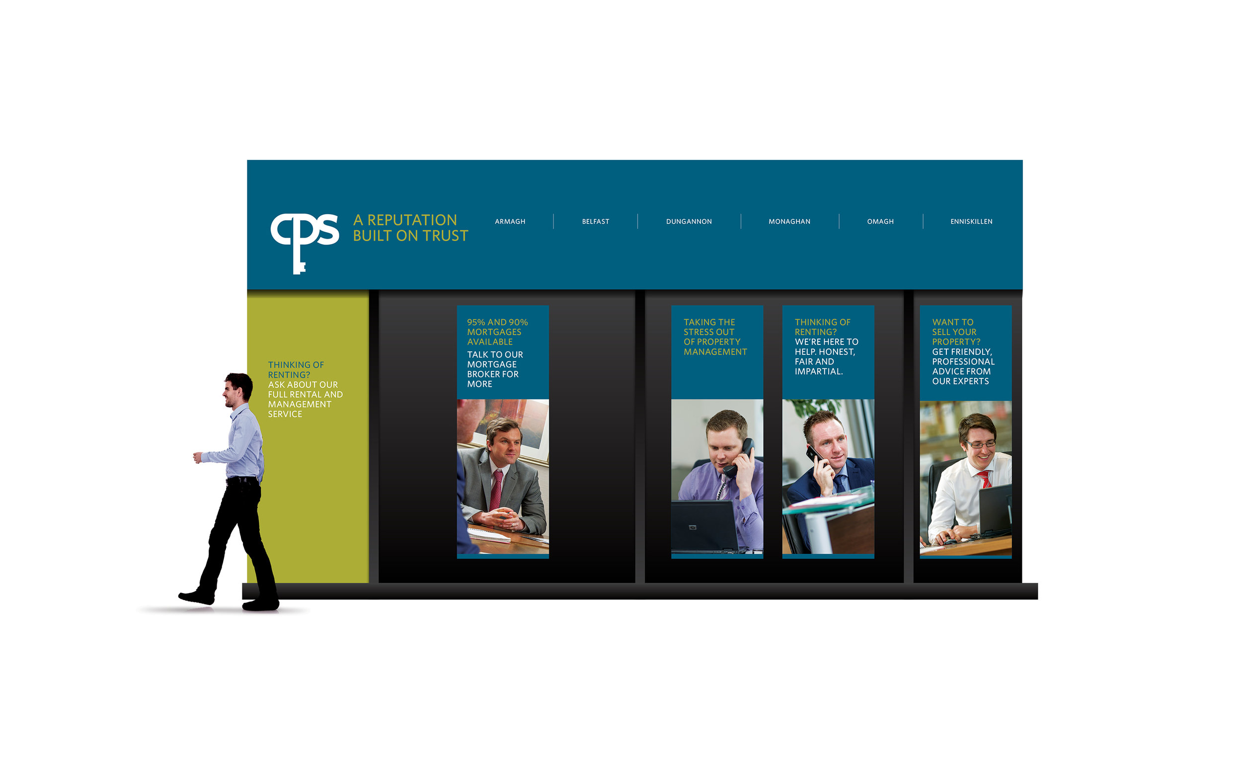
CPS approached good to refresh and update its branding. Their old communications were unconvincing and parochial. Not only that but a lack of visual cohesion ran through their materials with different logos being used on different collateral and fussy, busy layouts with no obvious hierarchy of information leading to confusion and a diluted message. good sought to de-clutter and focus the brand and the messaging. Our proposal was simple clean and to the point and hinged on a fresh new logo, new signage and host of other branded materials.

Ego are a Dublin based beauty consultancy who wanted a classic and iconic brand marque for their business. We drafted a bespoke logo that incorporated a stylised version of the owners face in the letter ‘g’.

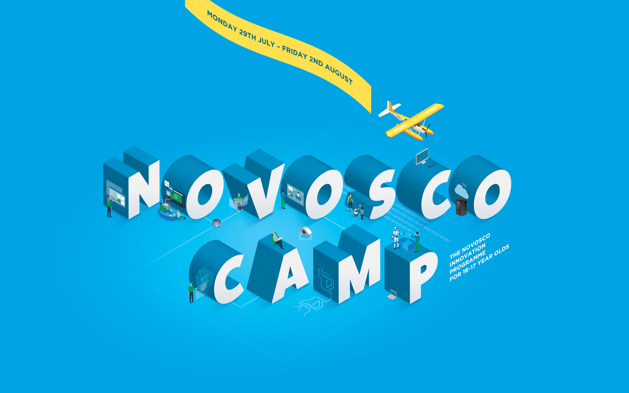
Cloud Camp is part of Novosco’s commitment to developing Northern Ireland’s IT talent for the future. Aimed at 16-17 year old students interested in a career in IT, Cloud Camp is free and provides valuable hands-on IT infrastructure, software and security experience with professional IT engineers and lecturers. We branded the event and produced a series eye catching ads to sell it both on and offline.

The annual NI Hospice Midnight Walk is an event organised by the charity to help fund nurses and to provide care to local people living with a terminal illness. Although a serious event we highlighted the fun, communal aspect of the event with a quirky, eye catching illustration that could be used across multiple channels.

Just grow is a small Northern Irish company dedicated to selling plants and seeds online. The needed a simple, flexible marque to roll out to their different marketing materials. good helped with the brand naming, packaging, identity and art direction.

It’s not everyday you get to work with one of your heroes so when a key player in the online distribution of interactive comics asked us to help out with a series of mobile apps for acclaimed graphic novel artist Simon Bisley we jumped at the chance. good produced the user interface design and custom iconography for the iPad, iPhone and Android.

Sandowns previous branding was dull and unimaginative and did little to portray their reputation as a high end cosmetic dental studio. They approached good to give their tired brand a much needed overhaul. The solution was a bespoke, elegant hand drawn marque – drawn to look like a swan. On closer inspection the viewer can clearly see the letter ‘S’ from the word Sandown. But why the swan? The Ugly Duckling by Hans Christian Andersen tells of a little bird who struggles through life until his transformation into the most beautiful bird of all, the graceful white swan. The story is beloved around the world as a tale of personal growth and transformation for the better.

For the last 5 years Act Mobile have been working on a rather unique problem. Put simply; they have tasked themselves with creating a way to make the internet faster. In January of last year they had a major break through. good was approached in June and asked to monetise this breakthrough. The brief was simple – create a consumer brand that highlighted the enormous speed increase that they could provide.

good produced a series of infographics to highlight changes to food hygiene in Northern Ireland. The illustration was adapted for use across the Food Standards Agencies social media channels and was also used for print.

Branding and art direction for a social music festival site where users can upload photos, talk about music and interact.

Undoubtedly one of Derry City Councils calendar events for 11 years now, the legendary City of Derry Jazz and Big Band Festival sweeps a frenzied fever across the city. Over 35,000 music lovers take to the streets every year in pursuit of great music, which features over 70 venues and over 200 musicians. After hours of research into jazz as a genre and it’s visual history our solution was a classic vibrant take on the beautiful jazz posters of the sixties albeit with a thoroughly modern feel. The new design captured an exciting, exhuberant new festival and one that could compete on a worldwide stage.

Wahlstrom is a Californian vodka with a difference. It’s unique spinning cone distillation process results in an exceptionally smooth taste that we wanted to highlight in the branding. The royal theme runs through all the marketing materials.

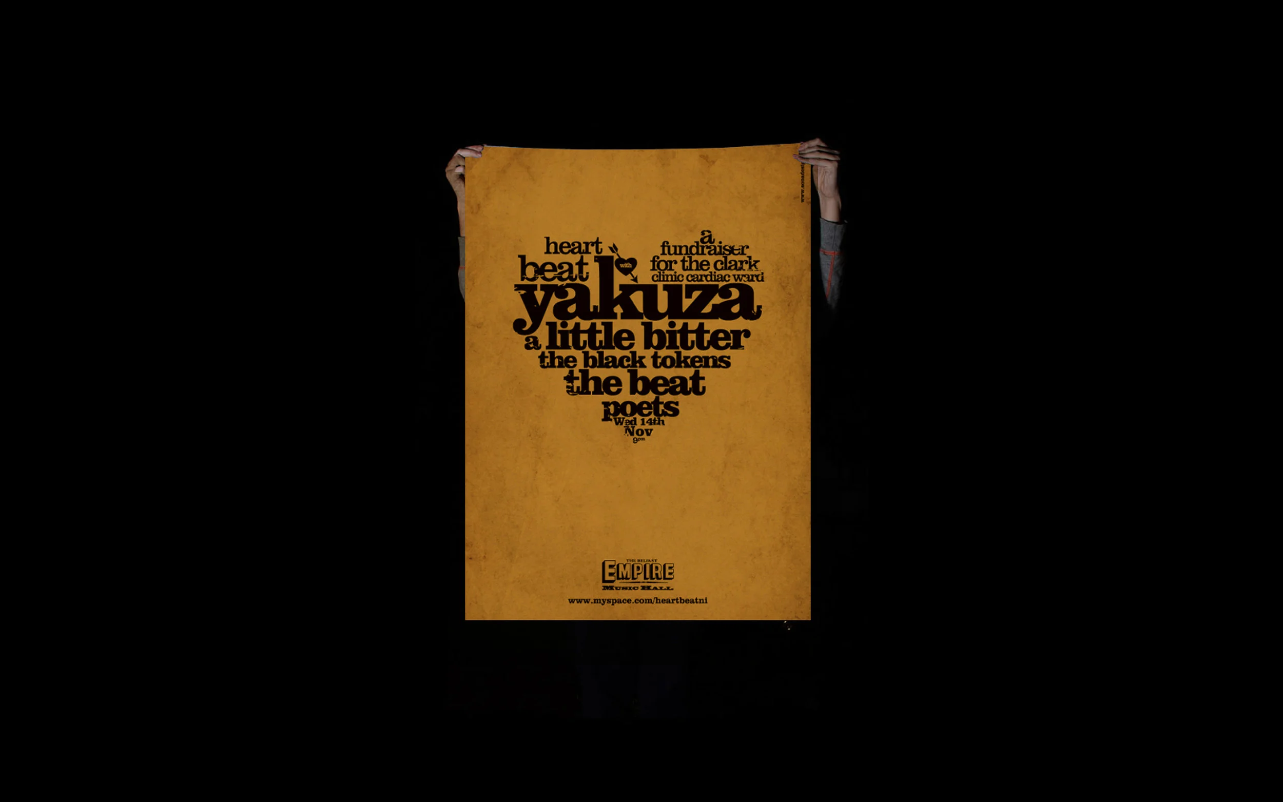
A one off, typographic poster for a the Clark Clinic Cardiac Ward in Belfast.
